DEVELOPMENT SNAPSHOT #102 — Rebuilding Research: Clear Details, Clean Links, an Equipment List
Contributed by: Takeshi Miyaoka on Sunday, November 15 2026
Last modified on Sunday, November 15 2026
I rebuilt the Research Management window in three steps. It's been a little over three weeks since #64, where I tried to make the research tree readable. As the number of research items grew, the details pane on the right turned into one long paragraph, the links in the graph picked up pointless steps and detours, and equipment development could only be compared card by card. Working from an improvement mock-up the user approved, I implemented the details pane, the graph links and an equipment development list in that order, and finally brought the research cards in line with the mock-up's size.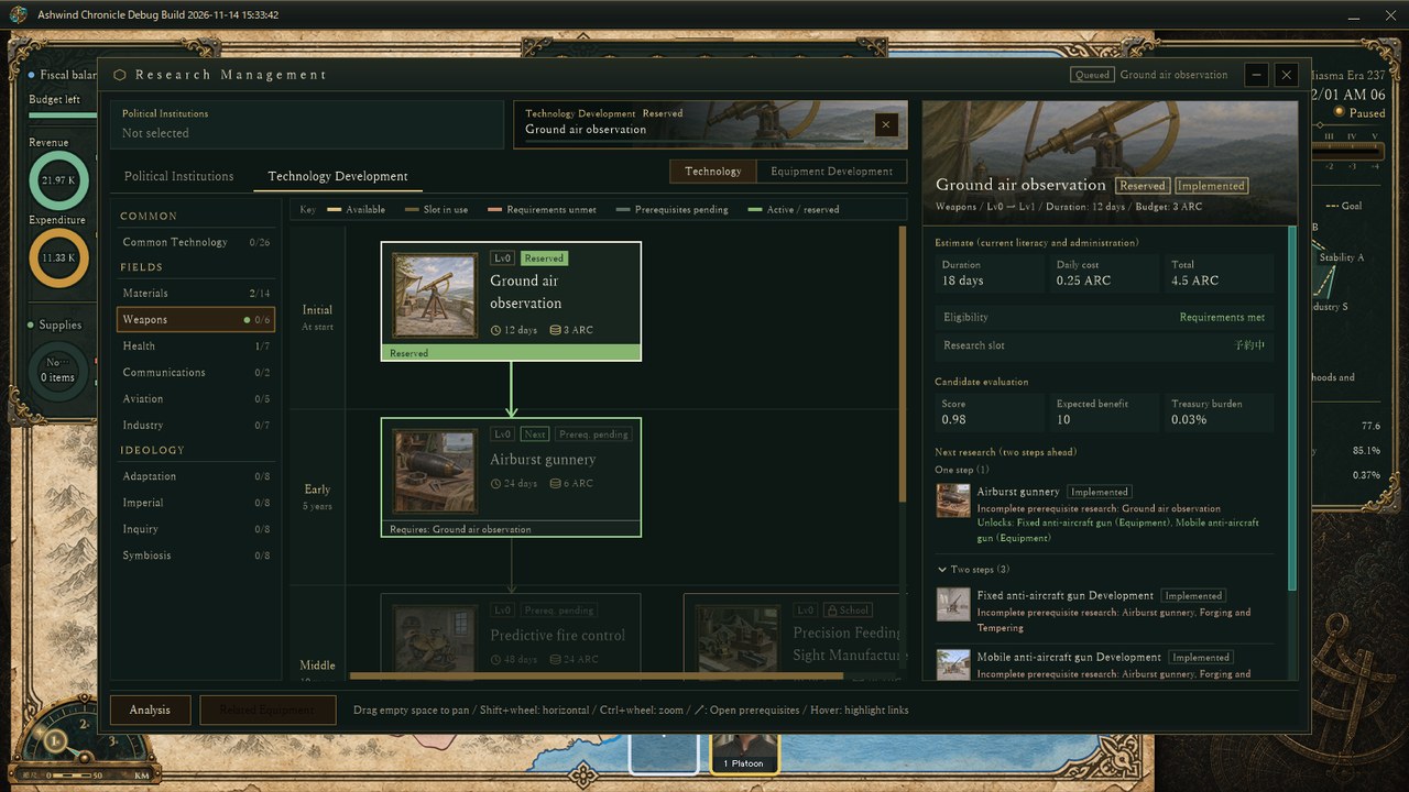
Technology Development > Weapons with Ground air observation reserved (an actual screen from the Debug build). The reserved card and the research right after it get a green frame.
1. A details pane split into sectionsResearch details used to come out as one block of text, so it was hard to tell where duration, cost, missing requirements and the next effect began and ended. The new pane is laid out in sections:
- Estimate: duration, daily cost and total under the current literacy and administration
- Conditions: whether it can be reserved, prerequisites, research slot, school requirements and so on (anything missing comes with the reason)
- Next level effects: only what the next level adds
- Candidate evaluation: score, expected benefit and treasury burden
- Next research: one step ahead, plus a foldable two-steps-ahead list, with images, status badges and the equipment each one unlocks
The explanatory notes that used to sit under estimates and effects are gone. The header now carries an "Implemented" or "Unpublished plan" badge, so you can see at a glance whether a research item already has an effect in the game.
2. A grid graph whose links take only three shapesThe graph now places each research item in the same column (line) as one of its prerequisites and joins the two card centres with a straight line. Links from other prerequisites bend once into an L along a single horizontal line between rows. If the exit column is blocked by another card, the bend happens just below the exit; only when both ends are blocked does the link go around between columns. Exits and entries use the full width of the card edge, spreading out from the centre by direction. For each gap between rows, the order of the horizontal lines is chosen to keep crossings to a minimum, and the remaining crossings are drawn with a hop arc. Lines are spaced 16 px apart horizontally and 20 px vertically.
This removed, for example, the needless step from Forging and Tempering to the culture vessel research in Materials, and the detour from sealed charges to barrel pressure design in Common Technology. Because the layout no longer searches for routes, laying out Common Technology (26 items) dropped from about 600 ms to about 15 ms.
3. Equipment development as a list by equipment typeEquipment development research used to appear as cards inside research categories such as Materials and Weapons. It is now a list grouped by the same equipment types as production. The left side lists types such as Infantry Equipment, Armor, Combat Vehicles, Support Equipment and Aircraft under the headings Infantry, Vehicles, Support and Air & Air Defense, and the centre shows a table for each sub-type (bows and crossbows, firearms, gunships, transport aircraft and so on).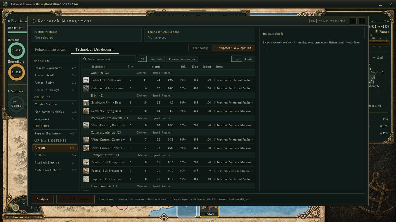
Equipment Development > Aircraft. Each row shows three key stats for the type (defense, speed and reconnaissance for aircraft), then reliability, days, budget, and prerequisites and status.
The stat columns follow the type: soft attack, hard attack and piercing for infantry equipment, and the main effect for support equipment and air defense. Name search looks across every type, and you can filter by All, Available or Prerequisites pending. The switch at the top right still shows the old card graph. Clicking a row reserves the research just like clicking a card; if it can't be reserved, the details pane shows why, along with its effects and cost. The details pane now also lists the equipment's stats. In the initial master data, 63 equipment development items are split across 12 types. The master data's "sea weapons" are really floating ships, so the research screen alone calls them Airships (the master data name is unchanged).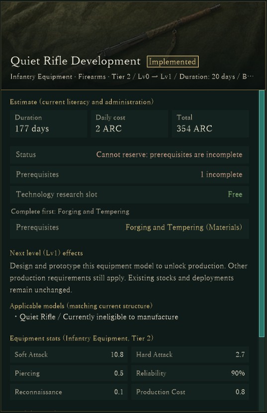
The details pane after clicking an equipment row (Quiet Rifle Development): the estimate, why it can't be reserved yet (a prerequisite is incomplete) and the next level's effects, followed by the equipment stats.
4. Research cards at the mock-up's sizeLast, the user pointed out that the cards didn't match the mock-up and had too much empty space, so they shrank from 360×176 to the approved 296×136. The image now fills the space above the bottom band, followed by a row of badges (level, previous/next, reserved, active, prerequisites pending, school requirement and so on), the name, duration and budget with clock and coin icons, and a 20 px status band. Active and reserved research get a green frame and band. Long English names shrink until they fit on two lines (down to 13 px) and, if they still don't fit, wrap to three lines so the full name is shown.
What I checkedEach step went into main only after the research-related automated tests passed (610 for step 1, 578 for step 2 and 595 for step 3) and every category and equipment type had been checked on actual Debug-build screens in Japanese and English. The improvement item is now complete.
About the imagesAll images are actual game screens, captured on November 14 while checking the card changes, by starting the Debug build without showing its window in a verification state started from the initial master data (image 3 is the details pane on the right of the screen after clicking an equipment row). Nation names and values belong to the verification state. A few labels, such as the research slot status in image 1, are still shown in Japanese in the English UI.
The earlier research screen post: DEVELOPMENT SNAPSHOT #64 — A Research Tree You Can Read: Faster Opening, Visible Links, and Why You Can't Reserve
Check the files currently available and the development status on the download page